
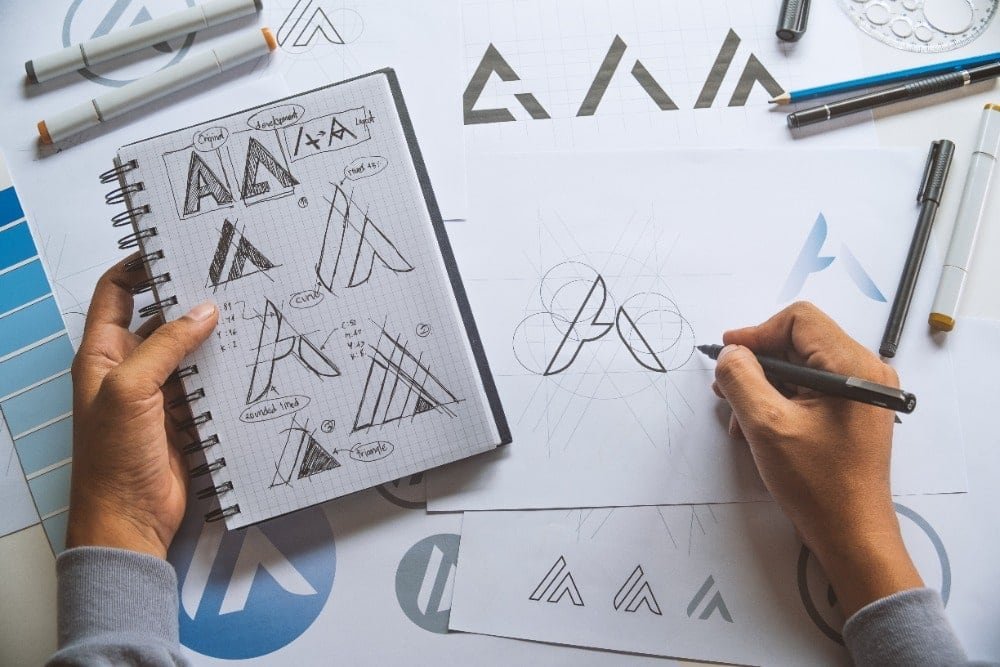
A memorable mark used to demand an agency budget, yet today the harder part is judgement: knowing which of dozens of instant options deserves to represent a business for years. The short truth is that generating candidates is now the easy afternoon task, while choosing wisely, securing the right files, and confirming that nobody else owns a similar design are the steps that decide whether the result serves you well or quietly becomes a problem.
Yes, a first timer can absolutely do this well. The process suits a careful beginner because the software handles variety and the human handles taste, context, and caution. The same discipline appears whenever you build a brand on a tight budget: spend where it protects the future, save where tools genuinely suffice, and never let a low price tag rush a decision that will sit on every invoice, label, and shopfront you own.
How Do These Generators Actually Produce a Mark?
Two systems work together behind the friendly interface. A generative model produces imagery, suggesting symbols, mascots, and abstract shapes drawn from patterns learned across enormous collections of pictures. Alongside it, a template engine arranges your business name in many combinations of typeface, layout, spacing, and colour. You type in the name, an optional strapline, the trade you work in, and a few style leanings, and the service answers with page after page of candidates within moments.
Understanding that partnership explains both the strengths and the limits on offer. Variety is plentiful because templates multiply quickly. Polish is plentiful because the underlying shapes have been refined by designers whose work trained or stocked the system. Originality, though, is not guaranteed, since the same engines serve every other bakery, builder, and boutique asking similar questions in similar words. Strategy is absent entirely. No generator knows your street, your rivals, or the customer you most want to impress, which is why the briefing and judging stages carry so much weight.
Editing tools then let you adjust colours, swap typefaces, nudge spacing, and try the symbol with and without the name attached. Work patiently rather than falling for the first attractive option. Appropriate, distinctive, and durable is rarer than pretty, and those qualities only emerge when you compare candidates against the needs of the actual business.
What Belongs in a Brief Before Generating Anything?
A short written brief, prepared before opening any generator, transforms random browsing into directed searching. Start with the basics: the exact business name as customers will read it, any strapline you truly intend to keep, and the trade described in plain words. Add the audience. A mark courting wedding clients speaks a different visual language from one courting landlords with emergency repairs, and feeding that difference into your choices prevents a long detour through unsuitable styles.
Include feelings, not just facts. Write down a handful of words for the impression the business should leave, such as steady, playful, precise, or homely, and a handful for impressions to avoid. Note rivals whose look you admire from a distance and rivals you must never resemble, since confusion with a nearby competitor is among the costliest outcomes a new mark can produce. Mention practical homes for the design as well: a van side, a coffee bag, an app icon, an embroidered shirt. Each home favours different levels of detail.
Finally, record your colour thinking. Colours carry associations that vary by trade and culture, and practical consequences too, since a mark that depends on a subtle gradient may reproduce poorly in print or stitching. With that brief written, generation becomes a search with a destination.
How Should You Judge Options at Real-World Sizes?
Generators present candidates large, glossy, and centred on a clean screen, which is almost never how the world will meet your mark. Shrink every serious contender to the size of a phone icon and a social profile thumbnail. Fine lines vanish, small lettering clogs, and intricate symbols collapse into smudges. The designs that survive this shrinking with their character intact are the ones built on strong simple shapes, and they deserve to move forward while prettier but fragile rivals fall away.
Strip the colour away next. A sound mark works in plain black on white, because life will demand exactly that version for photocopies, engraving, single colour print, and embroidery. If removing colour removes the entire idea, the idea was decoration rather than identity. Squint at the silhouette, view it upside down, and picture it from across a street. These homely tests sound unglamorous, yet they predict real performance far better than another hour of admiring full screen previews.
Bring outside eyes in before deciding. Show a shortlist to a few people who resemble your customers, say nothing about your favourite, and ask what kind of business they think each mark belongs to. Wrong answers are valuable information. Live with the leading candidate for a few days as well, printed and pinned where you will pass it often. Marks that grow on you quietly tend to outlast marks that dazzle once and then irritate.
Which Files and Versions Must You Walk Away With?
File formats decide whether a pleasing screen image becomes a usable business asset, so treat the export package as part of the purchase rather than an afterthought. Insist on scalable vector versions, the kind stored in formats built for resizing without any loss of sharpness. A vector master can become a shop sign, a vehicle graphic, or a tiny website icon with equal ease. A single small raster picture, by contrast, pixelates the moment anyone enlarges it, and recreating it later costs the money you thought you had saved.
Ask for a sensible family of versions. You want the full colour master, a plain black version, a white version for dark backgrounds, and the symbol alone without lettering for tight spaces such as profile pictures and favicons. A horizontal arrangement and a stacked arrangement both earn their keep across websites, labels, and documents. Keep the originals somewhere safe, backed up beyond the generator account itself, because accounts close, services change hands, and the master file of your identity should never depend on a login you might lose.
Before paying, read what the licence actually grants. Packages differ in whether they allow trademark registration, merchandise, or resale of items carrying the design, and the cheapest tier sometimes withholds the vector files or restricts commercial use in ways that surface painfully later. Paying a little more for complete files and clear rights is among the wisest small spends a new business makes, a logo endures for years, so its foundations should be built to endure as well.
How Do You Check Nobody Already Owns the Design?
This stage is non negotiable, because generators do not screen their output against existing protected marks. A design can emerge resembling a real brand purely because the underlying models absorbed countless real examples during training. Discovering that resemblance after signage, packaging, and a website have launched turns a small saving into an expensive and embarrassing relaunch, and a legal complaint can force the change on a timetable you do not control.
Begin with the official records. The trademark search service at the United States Patent and Trademark Office lets anyone look through registered and pending marks by name, owner, and category of goods or services. Search your business name, close spellings, and descriptions of your symbol, within your trade area and neighbouring ones. Then widen the net with ordinary web and image searches, marketplace browsing, and a look at businesses in your region using similar names or imagery. Identical marks in unrelated trades often coexist peacefully, while similar marks aimed at similar customers are where trouble lives.
Keep notes of what you searched and when. If anything looks uncomfortably near, walk away from that candidate, because you have dozens more and attachment is cheap at this stage. Where the business will invest heavily in branding, paying a professional to run a thorough clearance search is money well spent.
When Does a Human Designer Earn the Extra Spend?
Generated marks serve young and small ventures remarkably well, yet recognisable situations call for human craft. Established firms with equity in an existing look need evolution rather than replacement, and that sensitivity is a designer strength. Crowded categories, where every rival generated their identity from the same engines last year, reward the distinctiveness that a person interviewing you and studying your market can deliberately build. Demanding applications matter too: embroidery, engraving, and unusual signage all punish fussy artwork, and a designer who knows those trades designs around their limits from the first sketch.
There is also a middle path worth knowing. Generate widely, choose a promising direction, and bring in a designer briefly to refine that direction into a polished, properly constructed mark. The fee stays modest because the exploration is done, and the result gains the file quality and spacing discipline that automated output lacks.
Whichever route you take, decide with the lifespan in mind. A mark chosen in an afternoon may represent the business for a decade or longer. Spending an extra day on judging and an extra check on ownership is not extravagance. It is proportionate care for the most frequently seen piece of design your business will ever own, a point the Wikipedia entry on the logo as a form of identity reinforces when it traces how enduring marks hold meaning across generations of customers.
Can You Change the Mark Later Without Starting Over?
Yes, and most long lived businesses refine their identity gradually rather than replacing it in one dramatic leap. Small adjustments to spacing, weight, or colour can modernise a mark while keeping the recognition customers have already built. Keep your master vector files safe, record the exact colours and typefaces you settled on, and future refinements stay simple whether a designer or a future tool handles them.
What If Two Generated Options Look Equally Strong?
Return to the practical tests rather than personal taste. Shrink both to thumbnail size, strip both of colour, and picture each on your busiest real surface, whether that is packaging, a van, or a profile picture. Ask a few customers which business they would trust from each mark alone. The candidate that survives those trials with its character intact is the safer long term choice, even when the other looked prettier on a large screen.
How Long Should the Whole Process Take?
Generation takes minutes, yet a sensible first attempt deserves an unhurried afternoon spread across briefing, generating, judging, and checking ownership. Sleeping on a shortlist before committing almost always improves the decision, because familiarity exposes weaknesses that novelty hides. Rushing serves nobody when the result will sit on every surface your business owns for years to come.
One comment